
Voluntopia
Prototyping UX/UI Design Research Branding Wireframing
"Volunteering is a great way for individuals to make a difference in their community, but recent studies (Links to an external site.) suggest that America is currently experiencing its lowest rate of volunteerism in the last two decades. Yet, most people will still agree that they careabout their community and giving back to it"
2 Months
Designer 1/3
Background
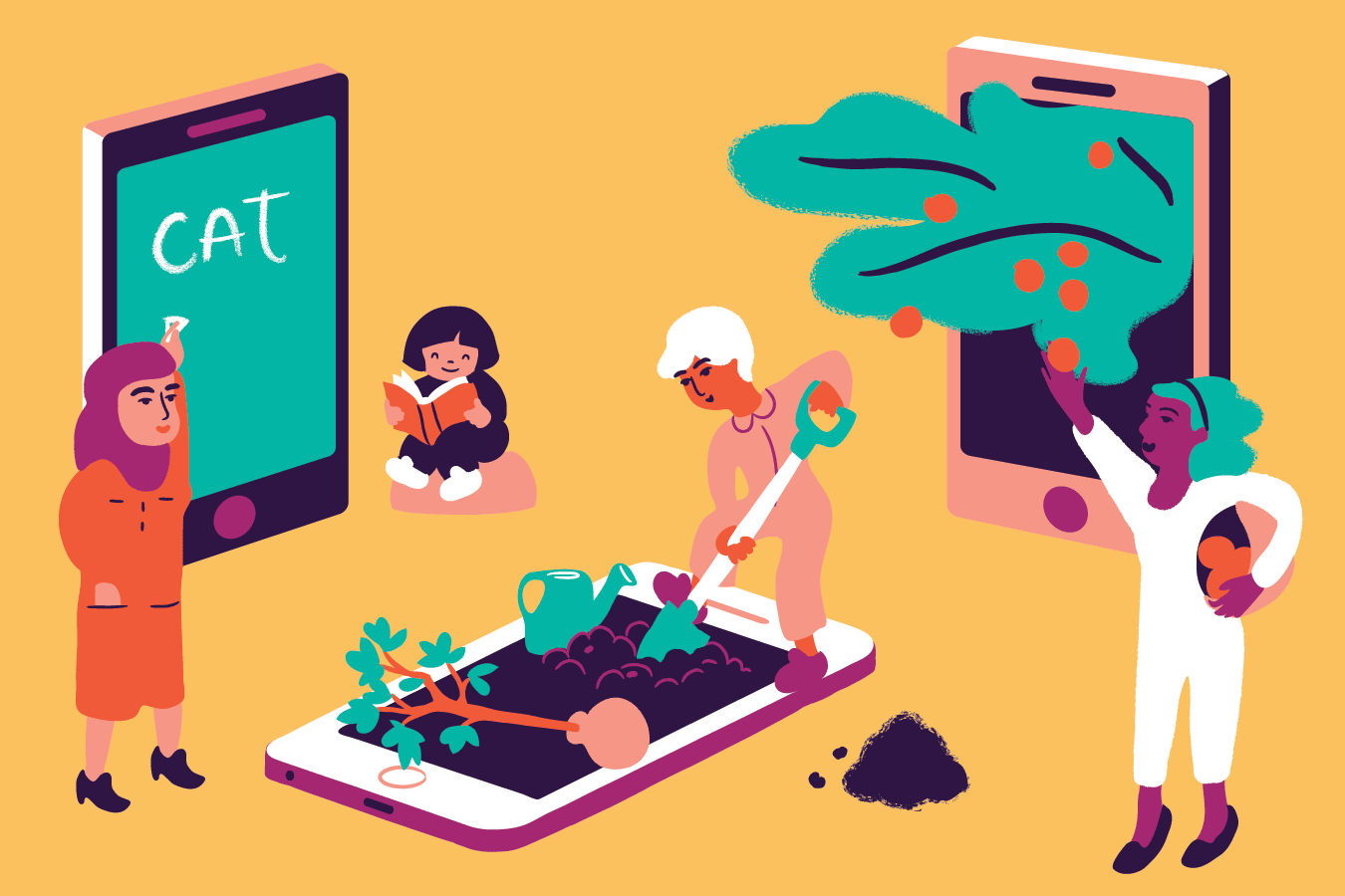
The purpose of this project was to create a unique micro-volunteering application that engaged users to participate in this new and growing space. Micro-volunteering is only defined by being short and easy to complete tasks, often digital in some way. We were given some UX materials to work off of and full creative freedom to design a beautiful and fitting experience. I chose to stick with and further the “utopia” concept from the brief, where users progressed a small virtual town with every real life volunteering task they completed.
The Problem
The problem was to make volunteering engaging, exciting, and to further the concept given to me in the wireframes. I was designing with an older target demographic in mind, as they are the primary users. However I also wanted to engage a younger audience with a fun and exciting app as well.
My Solution

The Process
Early Ideas From the Client Brief
I was given a brief about the client, the project, and a few resources to start with. The first of these was wireframes was for an app called Voluntopia. I had the choice to move forward with this concept or reinvent it with a new idea. I decided to keep it based on research and user feedback I will speak to later on. I only wanted to change the client’s concept if I had rock-solid evidence pointing in another direction, which I did not.
.png)
.png)
Next my team and I discussed major aspects of the product such as user needs, service design triggers, inspiration, commercial drivers, and constraints. A major point was the importance and expansion of reward systems and gamified elements like the ones present in the wireframes.
.png)
Exploring the Market
To begin I researched and explored the domain. In doing so, I discovered important data about the audience. What I found is 85% of surveyed users are interested in finding volunteer opportunities online, yet only 25% currently do. On top of this, most users had been drawn away from searching online because they were dissatisfied with the results they had found on various platforms. This meant the best route was to create somewhere users could find credible and ample volunteering opportunities within our app. This would be an important selling point to illustrate in the design. Source

Next, I worked on a design-focused competitive analysis to learn more about the space. I observed bright signature brand colors a lot of apps were using. I liked the blues and greens as a central color and I wanted to do something similar but bring back the saturation to lighten things a bit. I liked the cleanliness of having only one color but also wanted to expand the palette slightly to increase visual interest. Usability wise, many apps in this space had a simple, intuitive feel and kept the focus on the volunteering tasks as a result.
.png)
Design Starting Point

Test


Nature, Community, Light
Fresh, Vibrant, Connection
Utility, Public Service
My next step was the creation of mood boards and corresponding style tiles. I looked to represent community, credibility, and functionality while keeping my target demographics in mind. I created three divergent aesthetics in order to choose a final design direction. I made these concepts based on domain research and brief information to try and create visually appealing and targeted solutions.
Click to expand
What Did the Users Think?
Following the creation of these style tiles, I did a round of user testing. I learned the blue/green colors tested well and that my light blue tile was most effective. However, both the gradient and light blue tiles tested positively so I took some key takeaways about the style, type, and colors to implement in my later iterations.
Design Principles
Now that I had a design direction I chose some design principles to guide the rest of my process. These are simple but important rules that needed to be present in my final product to keep things simple and usable even with a more complex concept.
Clarity
User recognition, interaction, and understanding; avoids confusion; inspires confidence.
Consistency
Uniform and purposeful design decisions.
Visual Hierarchy
Utilize color contrast, typography size and weight, buttons, and interactive elements to create ease of use and accessibility.
Fun
Enjoyable, rewarding & fun experience.
Early High-Fidelity Designs
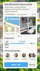
With my style tile and user feedback in mind, I began my first round of high-fidelity screen design. I made small refinements from my tile but most elements kept the same idea and aesthetic. I changed the leaf texture I had in my original to something similar and cleaner, and I made small tweaks to iconography and color.
-Most users had some confusion about the concept and it was clear that a more thorough onboarding experience was a must.
-Legibility in the serif body font was a big issue, especially on the lighter backgrounds.
-Overall users thought the utopia concept was exciting and enjoyed the uniqueness of it.
-Users appreciated the early micro-interactions and it was clear it significantly added to the experience.
.png)
.png)
.png)
Using these screens I created a simple prototype and did another round of user testing. These tests were focused on aesthetics more so than usability but I received impactful comments and suggestions on all aspects.
-Some users felt the color was too soft. Overall they felt the design was lacking color in many areas.
-One user had the idea of removing the bottom bar as the navigation tabs seemed rather unimportant.
Color Explosion
Based on this user feedback I made significant changes in my next round of designs. At the center of this iteration was a change in the art for the utopia map. In my early designs, I used assets given by the client for this, but they severely lacked color and did not have the energy and aesthetic I was going for. This new art was more 3D, colorful, and cartoony. When I first imagined the art of this app and I think of a utopia this is what comes to mind.
Now that I had this central component figured out, I made significant changes to the color palette. I did this to match the map and to account for the user feedback. I increased vibrance and added more color to every screen.
Next, I refined the typography. While the serif font was nice looking in the logo, it had legibility issues at lower sizes. On top of this, I wanted a simple, rounded font to match the aesthetic of the map art. As a result, the header and body fonts were both changed to sans serif, clean, and more much more readable options.
Lastly, I made some significant changes to usability. First I added an extensive onboarding to walk the user through the functional and gamified elements of the app. In addition, I decided to keep the utopia map at the center of the navigation. To do so, I removed the tabbed bottom navigation and many screens were popups above the utopia. This helped simplify things and keep the user immersed in their utopia world.

Final Deliverables
Clickable Prototype
High Fidelity Designs
.png)
.png)
.png)
.png)
<- Live Prototype! Start clicking around!
.png)
.png)
.png)
.png)
Design Sytem
Conclusion
During this project, I pushed myself to create lots of micro-interactions and a functional feeling prototype. I am happy with what I was able to learn from this and with the final products. I made significant changes to the design throughout and was able to be self-critical in order to iterate until I made things better. I learned first hand how you can improve as a designer by listening closely to feedback and not settling with mediocre.